Components
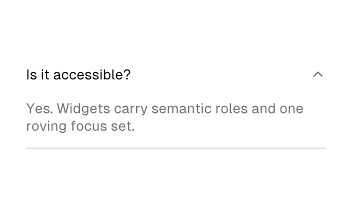
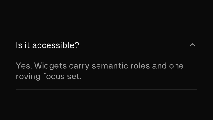
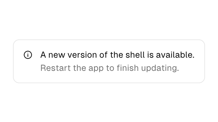
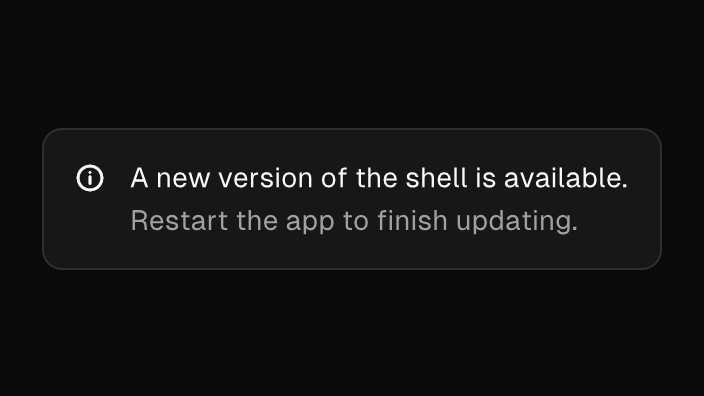
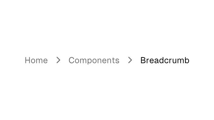
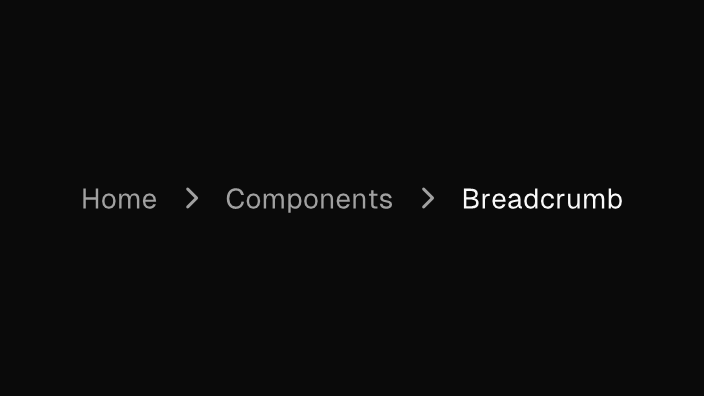
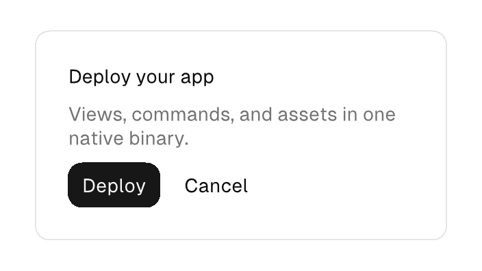
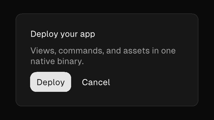
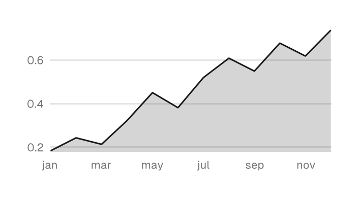
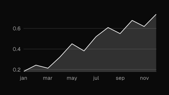
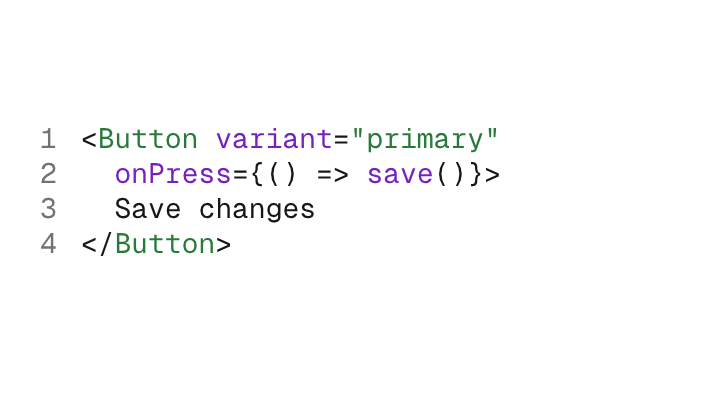
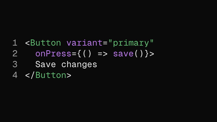
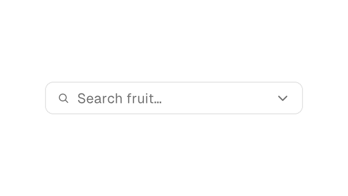
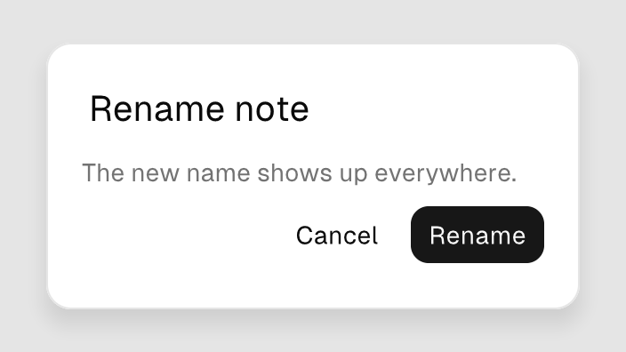
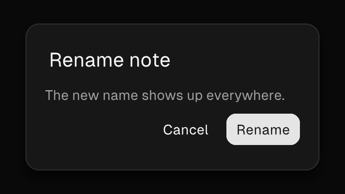
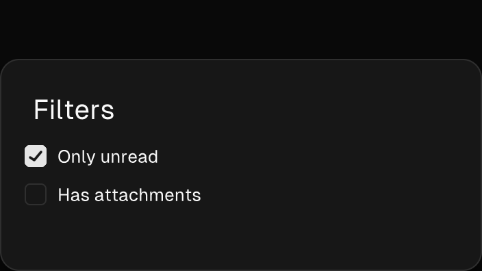
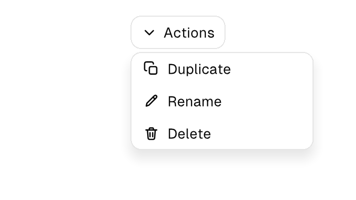
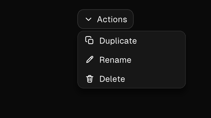
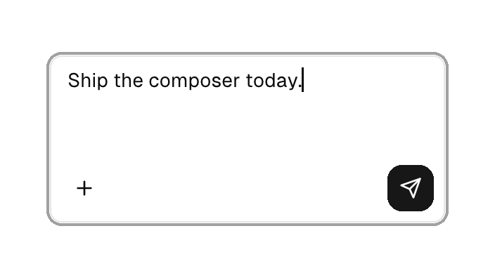
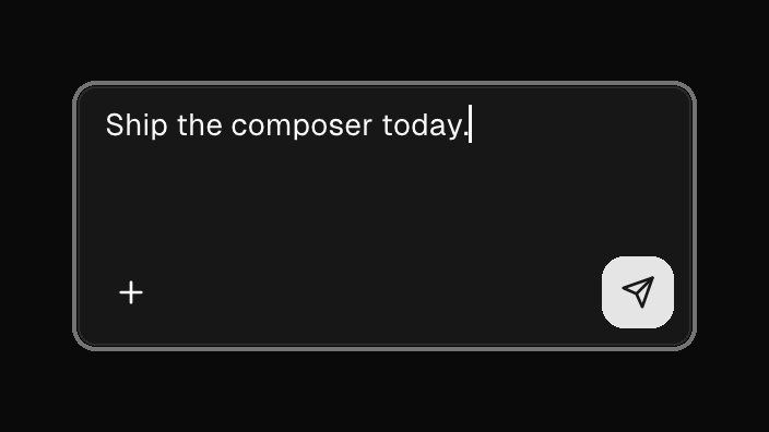
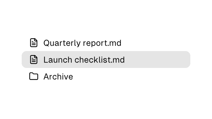
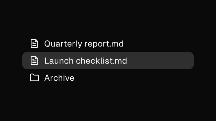
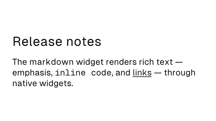
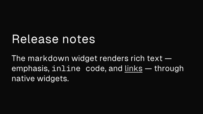
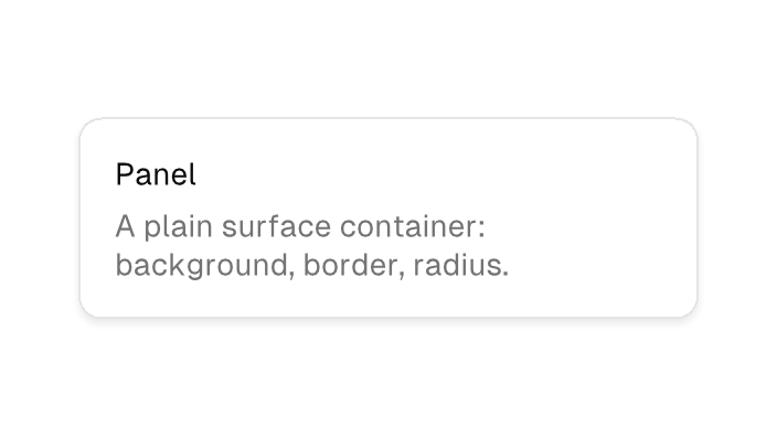
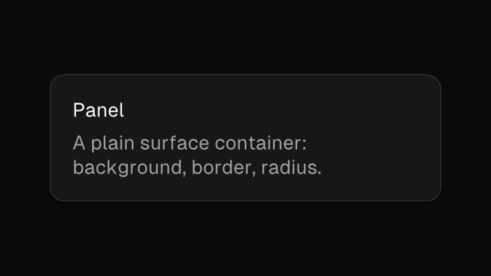
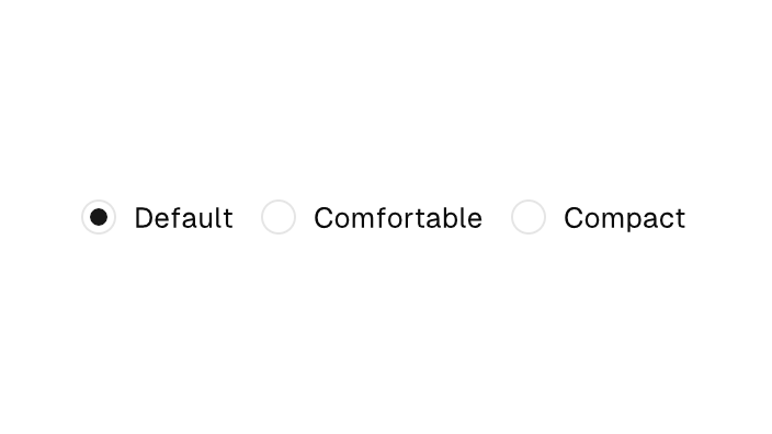
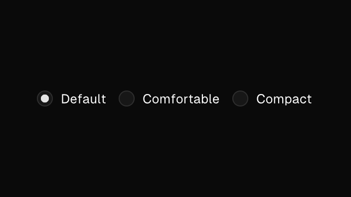
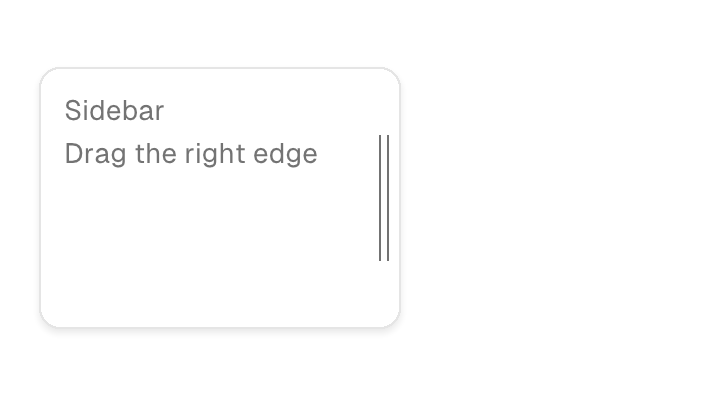
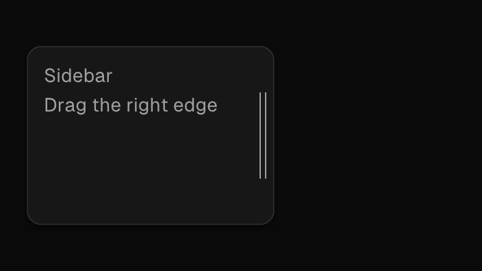
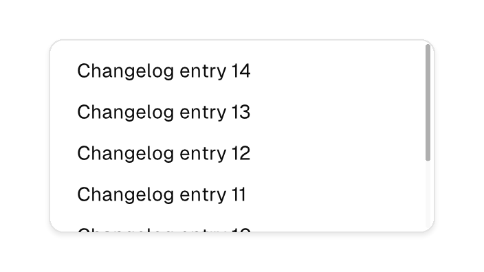
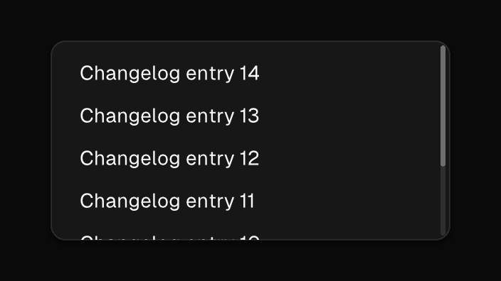
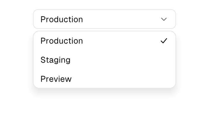
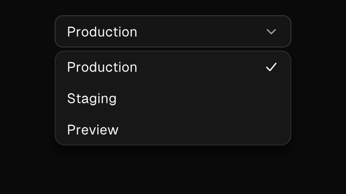
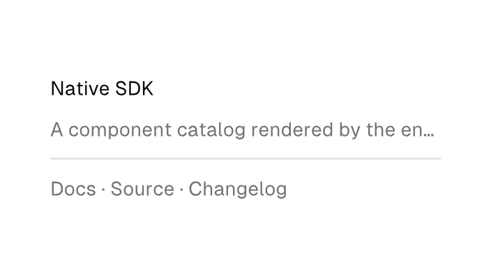
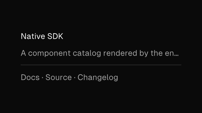
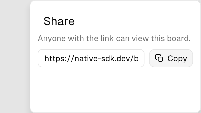
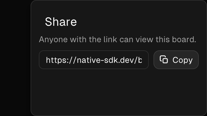
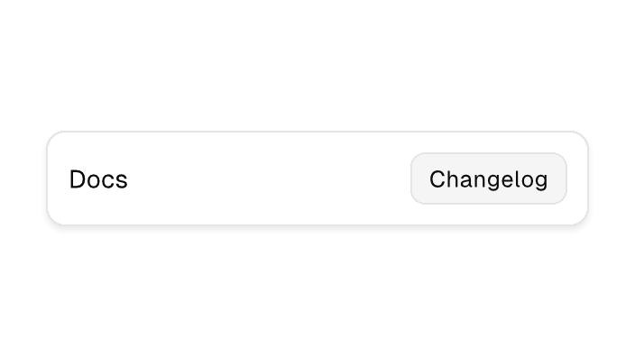
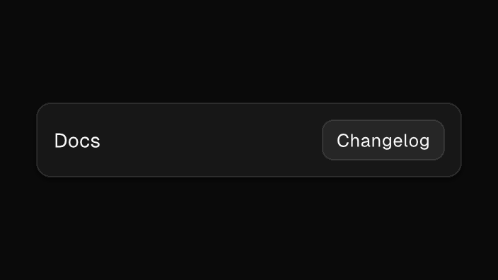
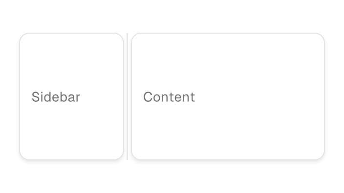
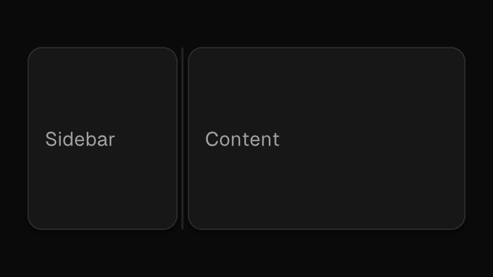
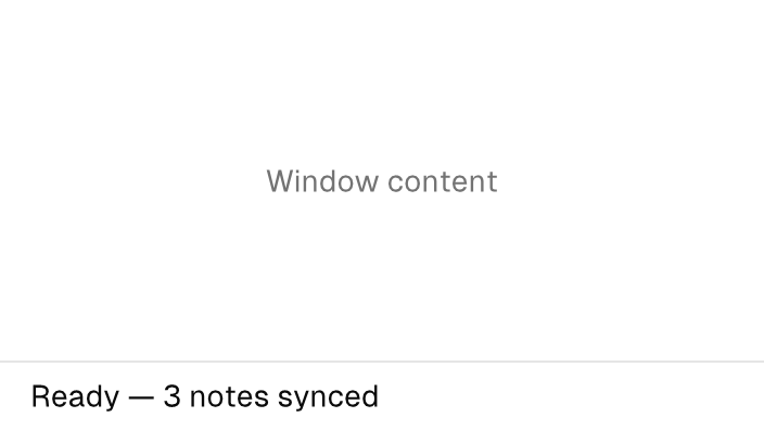
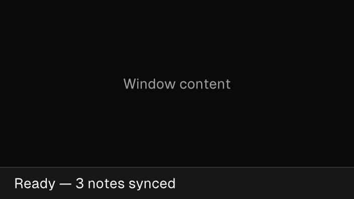
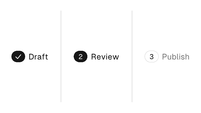
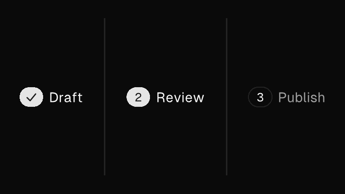
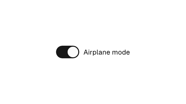
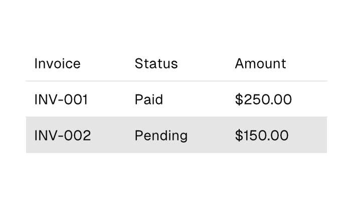
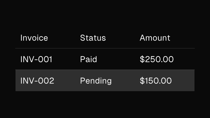
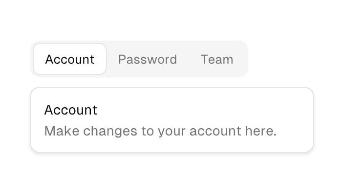
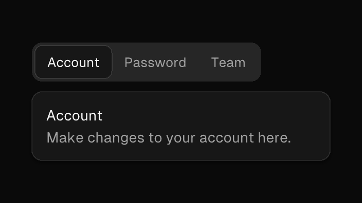
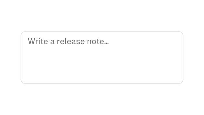
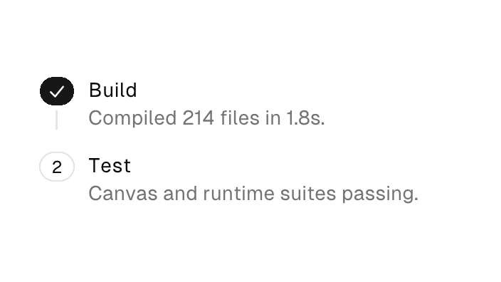
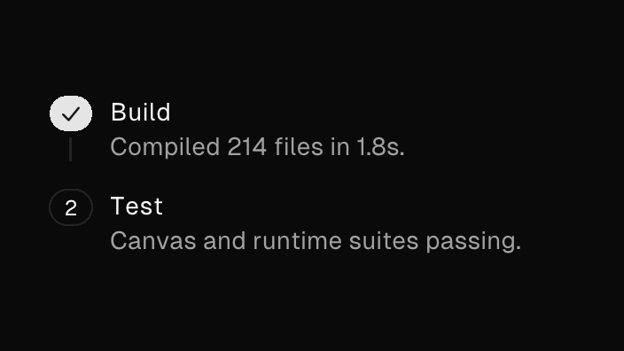
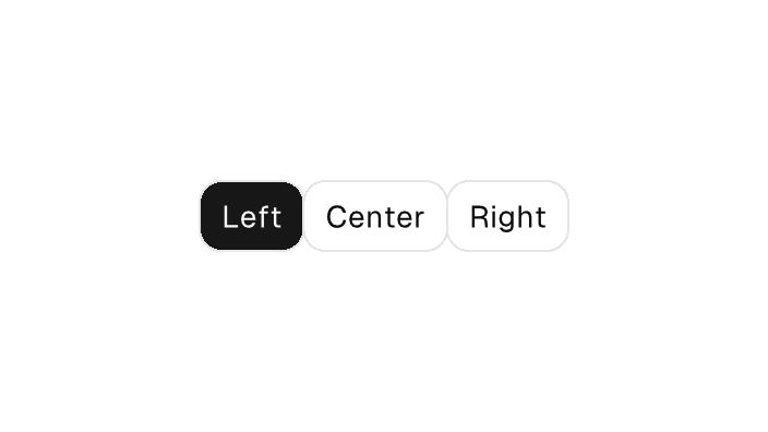
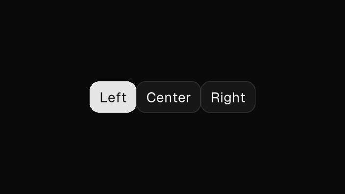
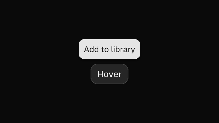
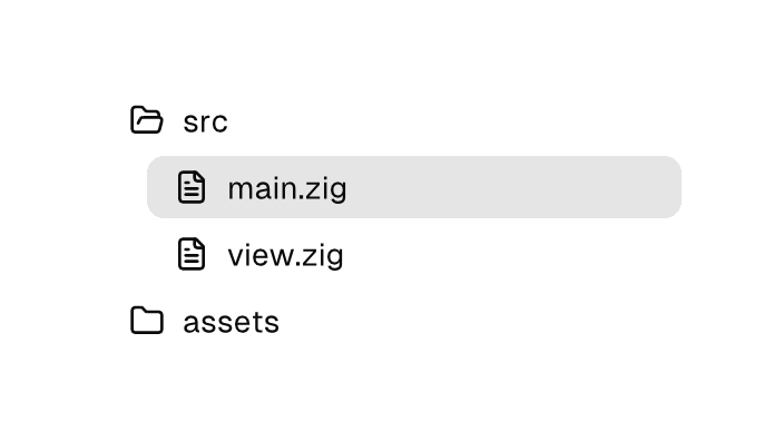
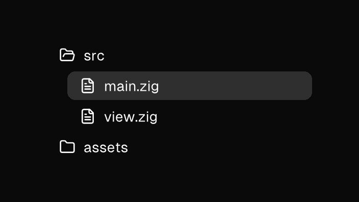
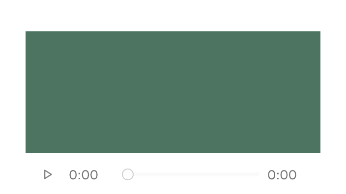
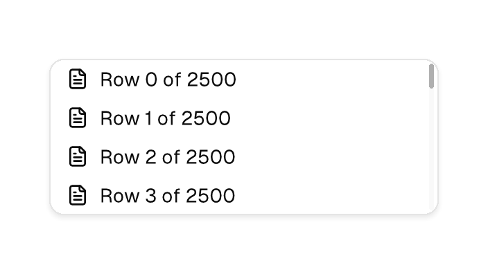
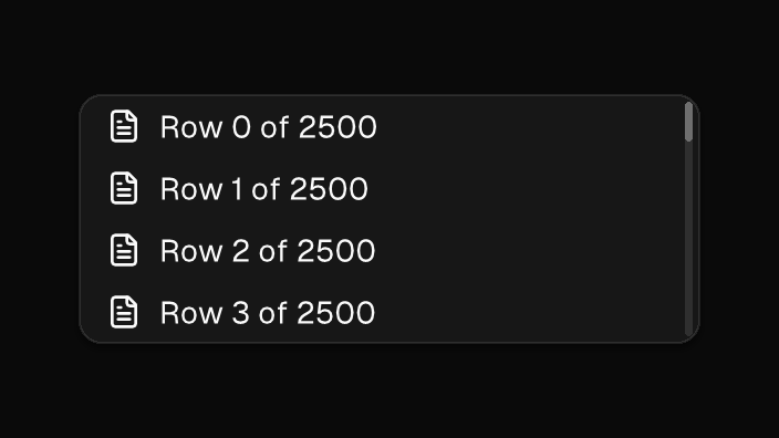
The Native SDK ships a built-in component catalog with house-style defaults: neutral surfaces, sharp Geist typography, subtle borders, focus states, compact density, and token-driven color, radius, shadow, and motion. Every preview below is rendered by the engine itself — the deterministic reference renderer draws the same widgets your app ships, pixel for pixel, in both color schemes. Each card shows one representative rendering; the component's page has the full set of variations.
Native markup is the view language: every page leads with the component's element — its tags, attributes, and bindings, sourced from the markup validator's vocabulary. Where a sample dispatches into app logic, the core side appears in both authoring languages, TypeScript first with the Zig form one tab away. Each page closes with the component's programmatic construction — the canvas.Ui builder, for Zig views built without markup. For layout semantics, expressions, and the runtime contract, see Native UI.