Code
Presents source text as bare monospace content with deterministic, theme-aware syntax highlighting. The component supplies no background, border, radius, shadow, or padding; wrap it in a panel, card, or another container when the surrounding design calls for chrome. Code is selectable and read-only by default. Add editable and on-input to opt into the multiline editor without losing syntax colors. Code wraps by default. Set wrap="false" to preserve logical lines inside one horizontal scroll region, and opt into logical line numbers with line-numbers.
HTML-family highlighting understands HTML, XML, SVG, JSX, and TSX structure: element or component tags, attributes, strings, comments, numbers, and JavaScript/TypeScript expressions receive distinct theme-token colors.
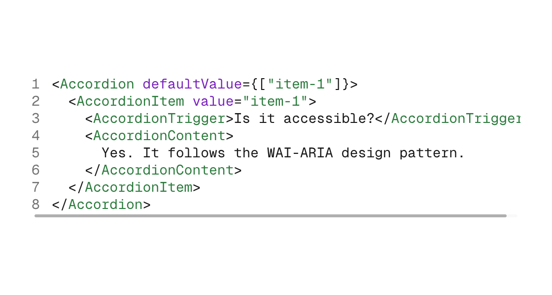
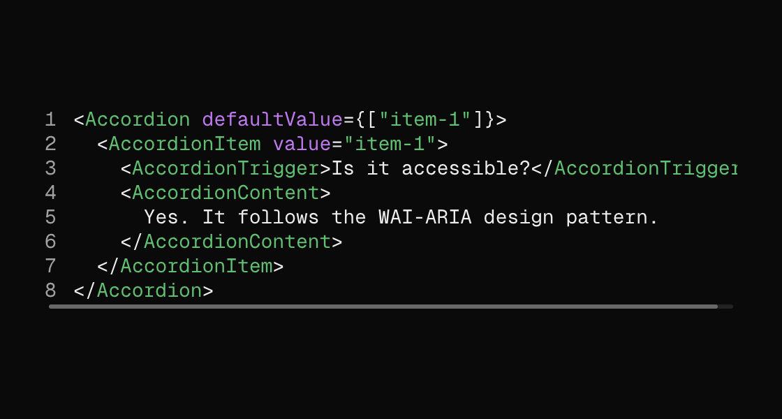
Markup
<code
  source="{component_source}"
  language="tsx"
  line-numbers
  wrap="false"
  width="480"
  label="Accordion example"
/>
source is required and must be one {binding} producing text. language is a literal lexer name; unknown names are validation errors. Line numbers are off by default and remain decorative, so selecting and copying a numbered block returns only the source text. Numbered presentation is limited to 128 logical lines; longer sources keep all code and omit the gutter.
Added and removed lines
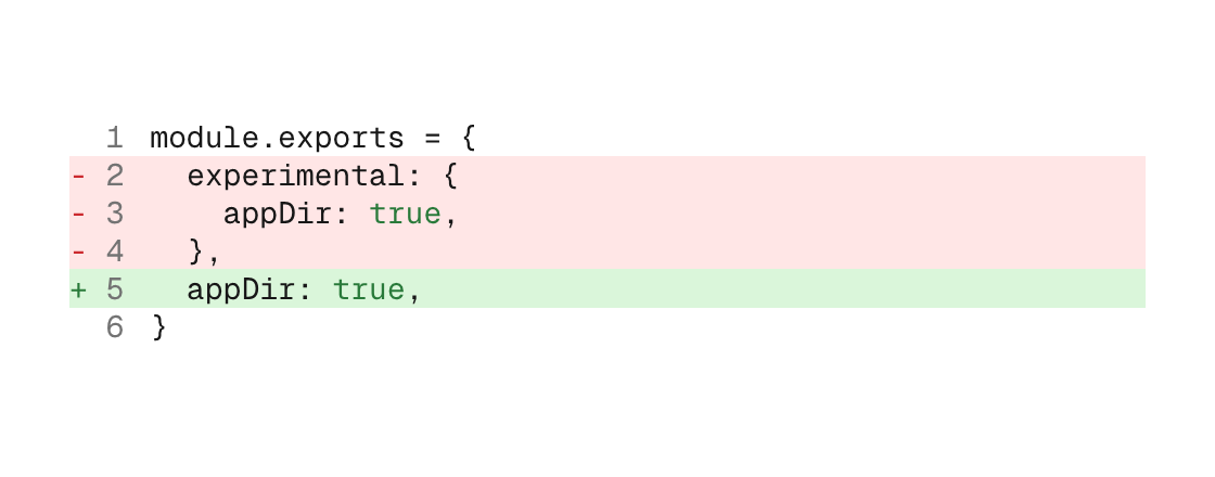
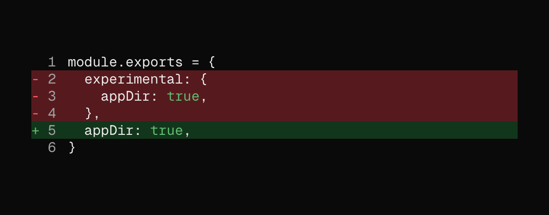
Diff presentation follows Geist Code Block in the default and Geist theme packs, across light and dark appearances. added-lines and removed-lines apply full-width green/red washes and renderer-owned +/- markers while the underlying source, syntax highlighting, selection, and copied text stay unchanged.
<code
  source="{migration_source}"
  language="javascript"
  line-numbers
  added-lines="5"
  removed-lines="2-4"
  wrap="false"
  width="480"
  label="Configuration migration"
/>
Line specs are one-based comma lists and inclusive ranges: added-lines="5, 9-11". They annotate clean source—the + and - are decoration, not bytes callers must splice into the model. This keeps the selected/copied result usable and lets language continue highlighting the real grammar. A line cannot be both added and removed. Diff metadata is bounded to lines 1–128; read-only sources longer than 128 lines keep every source byte and omit the diff treatment.
For editable code, apply each TextInputEvent to the same model-owned buffer that supplies source:
<code
  source="{document}"
  language="tsx"
  editable
  on-input="edit_document"
  line-numbers
  wrap="false"
  grow="1"
  label="Document editor"
/>
The editor path includes multiline selection, caret navigation, IME, clipboard, and undo/redo behavior. It does not add textarea background, border, focus ring, or padding.
Surface styling belongs to a wrapper:
<panel padding="12">
  <code source="{component_source}" language="tsx" />
</panel>
Programmatic construction (Zig)
ui.code(.{
    .language = .javascript,
    .line_numbers = true,
    .added_lines = &.{5},
    .removed_lines = &.{ 2, 3, 4 },
    .wrap = false,
    .width = 480,
    .semantics = .{ .label = "Configuration migration" },
}, model.migration_source)
The editable path uses the same added_lines and removed_lines options when an editor needs annotations; keep those line numbers synchronized as edits change the document.
The Zig builder composes the same way when chrome is wanted:
ui.panel(.{ .padding = 12 }, .{
    ui.code(.{ .language = .html }, model.component_source),
})
The public lexer model is native_sdk.canvas.code. languageFromName resolves markup spellings, languageFromFence reads a Markdown info string, and highlight produces the same bounded, theme-colored span runs both renderers use.
Languages
Zig; JavaScript and TypeScript; JSX and TSX; JSON; YAML; shell; Python; Rust; C, C++, C#, Java, Kotlin, and Swift; Go; HTML, XML, and SVG; CSS, SCSS, and Less; SQL; and Markdown. An omitted language renders plain monospace.
Attributes
| Attribute | Description |
|---|---|
source | code: one required {binding} producing source text (a []const u8 field or fn; arena fns work). |
language | code: literal lexer name. Supports Zig, JavaScript/TypeScript, JSX/TSX, JSON, YAML, shell, Python, Rust, C-family, Go, HTML/XML/SVG, CSS-family, SQL, and Markdown; unknown names are a validation error. |
editable | code: true enables text editing while retaining syntax highlighting; pair it with on-input to apply TextInputEvent updates. Read-only by default. |
on-input | Names a Msg variant with canvas.TextInputEvent payload; delivers each text edit. |
line-numbers | code: opt into muted logical line numbers. Off by default; a wrapped logical line stays paired with its number. |
added-lines | code: one-based comma/range spec (for example 5 or 5, 9-11), or one text {binding}; applies Geist's green full-line wash and renderer-owned + without changing copied source. Lines 1-128. |
removed-lines | code: one-based comma/range spec (for example 2-4), or one text {binding}; applies Geist's red full-line wash and renderer-owned - without changing copied source. Lines 1-128. |
wrap | code: true by default. false preserves logical lines and puts the highlighted content in one horizontal scroll region. |
width | Definite width (plain number). |
height | code: definite height (plain number). Overflow scrolls vertically; with wrap=false the region scrolls on both axes. |
min-width | Width floor without a definite maximum. |
grow | Flex grow factor. |
key | Sibling-scoped identity key. |
global-key | Parent-independent identity: ids survive reparenting between containers. |
label | Accessible name for the code group. |