Radio
The single-choice value control, grouped by a radio-group. Give the group an accessible label that names the shared choice. Like checkbox, each radio takes its visible label as element content; the text attribute is the equivalent binding-friendly form. Descendant radios at any nesting depth form one logical group: one Tab stop, arrows wrap through the choices while Home/End move to the edges, focus and selection move together, and selecting one clears the rest. Bind the model's choice through checked; an actual selection transition dispatches on-change when bound, then falls back to on-toggle and on-press for compatibility. Activating the already-checked radio has no new on-change edge (a legacy fallback handler still receives the activation).
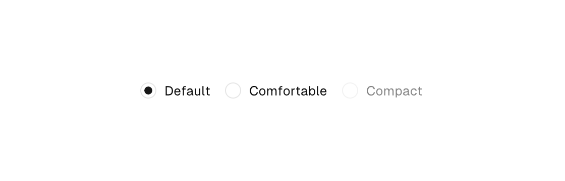

Markup
<radio-group gap="12" label="Density">
  <radio checked="{density == default}" on-change="set_default">Default</radio>
  <row>
    <radio checked="{density == comfortable}" on-change="set_comfortable">Comfortable</radio>
  </row>
  <radio checked="{density == compact}" disabled="true">Compact</radio>
</radio-group>
One field holds the group's choice — a string-literal union in a TypeScript core, an enum in a Zig core — and each radio's arm sets it:
// model: { readonly density: "default" | "comfortable" | "compact" }
case "set_comfortable":
  return { ...model, density: "comfortable" };
// model: density: enum { default, comfortable, compact } = .default,
.set_comfortable => model.density = .comfortable,Programmatic construction (Zig)
In a Zig view, the canvas.Ui builder constructs the same tree programmatically:
ui.el(.radio_group, .{ .gap = 12, .semantics = .{ .label = "Density" } }, .{
    ui.el(.radio, .{ .text = "Default", .checked = model.density == .default, .on_change = .set_default }, .{}),
    ui.row(.{}, .{
        ui.el(.radio, .{ .text = "Comfortable", .checked = model.density == .comfortable, .on_change = .set_comfortable }, .{}),
    }),
    ui.el(.radio, .{ .text = "Compact", .checked = model.density == .compact, .disabled = true }, .{}),
})
Attributes
| Attribute | Description |
|---|---|
text | Text value for text-bearing elements; a literal or one {binding}. |
checked | Checked state for checkbox/toggle; true/false or a {binding}. |
disabled | Disables the control; true/false or a {binding}. |
on-change | Dispatch a Msg on change: tag or tag:{payload}. Hit-target elements only. On a treeitem, Up/Down/Left/Right/Home/End focus movement prefers on-change over on-press, separating keyboard selection from pointer activation. |
on-toggle | Dispatch a Msg on toggle: tag or tag:{payload}. Hit-target elements only (checkbox, toggle, toggle-button, switch, accordion, ...). |
on-press | Dispatch a Msg on press: tag or tag:{payload}. Legal on any element — a bound press handler makes it pressable, and presses on plain text/icons inside it fall through to it (dragging still selects text). |