Input
Single-line text entry. input and text-field are the same foundation under two names: text and placeholder bind from the model, on-input names a Msg variant that receives every edit as a canvas.TextInputEvent, and on-submit dispatches on enter. search-field is the same control styled for search.
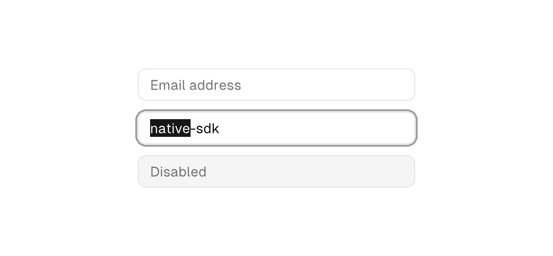
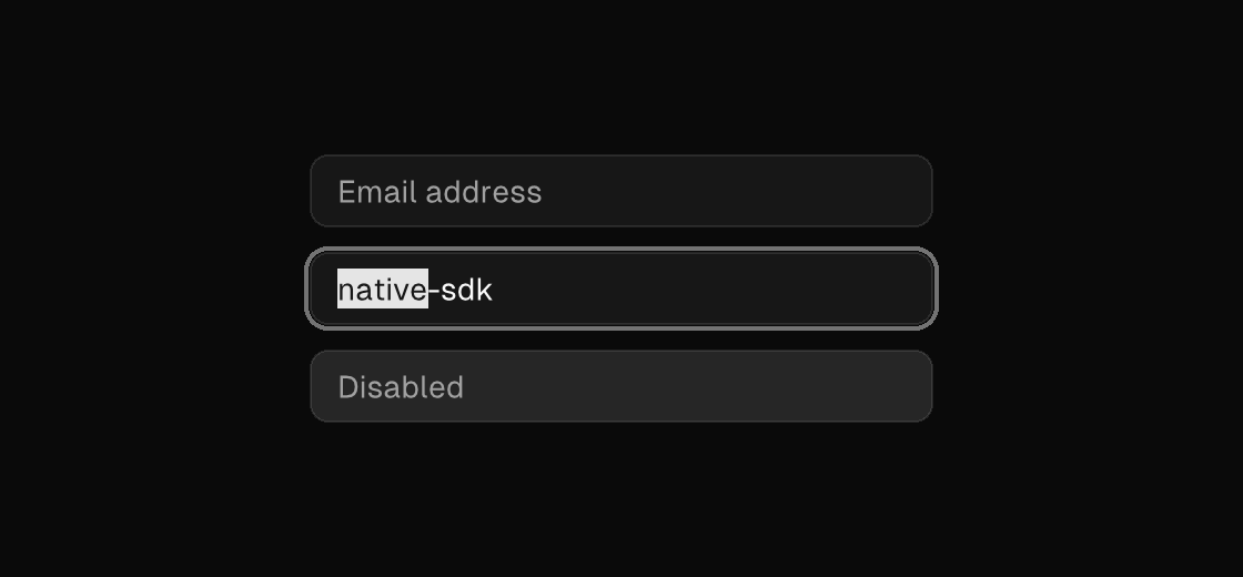
Markup
<column gap="12" width="280">
  <input placeholder="Email address" text="{email}" on-input="email_edited" on-submit="subscribe" />
  <text-field text="{project_name}" on-input="name_edited" />
  <input placeholder="Disabled" disabled="true" />
</column>
Zig builder
on_input takes a comptime message constructor: Ui.inputMsg(.tag) builds Msg{ .tag = edit } for each canvas.TextInputEvent.
ui.column(.{ .gap = 12, .width = 280 }, .{
    ui.el(.input, .{
        .placeholder = "Email address",
        .text = model.email,
        .on_input = Ui.inputMsg(.email_edited),
        .on_submit = .subscribe,
    }, .{}),
    ui.textField(.{ .text = model.project_name, .on_input = Ui.inputMsg(.name_edited) }),
    ui.el(.input, .{ .placeholder = "Disabled", .disabled = true }, .{}),
})
Search field
search-field renders the search affordance but binds exactly like an input; pair it with a model-filtered list. Whenever the field holds text it also shows a built-in clear affordance — a small x inside its trailing edge — and pressing it (or pressing Escape while focused) clears through the standard text-edit path, so the on-input handler receives the clear like any other edit and a model-owned buffer empties with it. No attribute enables or disables this; searchable fields simply carry it. For text entry that opens a menu of suggestions, see combobox.


<search-field width="280" placeholder="Search notes" text="{query}" on-input="query_edited" />ui.el(.search_field, .{
.width = 280,
.placeholder = "Search notes",
.text = model.query,
.on_input = Ui.inputMsg(.query_edited),
}, .{})Attributes
| Attribute | Description |
|---|---|
text | Text value for text-bearing elements; a literal or one {binding}. |
placeholder | Hint text shown while a text entry is empty. |
value | Value for slider/progress/text entry; a literal or one {binding}. |
disabled | Disables the control; true/false or a {binding}. |
autofocus | Focusable controls only: moves keyboard focus to the element when it mounts or when the value turns on (edge-triggered - holding it true never re-steals focus). The TEA way to focus an editor on create. |
on-input | Names a Msg variant with canvas.TextInputEvent payload; delivers each text edit. |
on-submit | Dispatch a Msg on submit: tag or tag:{payload}. Enter in a text field, primary+enter in a textarea; on a list-item, plain Enter dispatches it as the row's primary action while Space keeps the row's select (on-press). |
on-change | Dispatch a Msg on change: tag or tag:{payload}. Hit-target elements only (slider, ...). |