Slider
A draggable value control. The model owns value as a 0..1 fraction and renders it back on every rebuild; on-change dispatches when the user moves the thumb (drag, keyboard step, or accessibility set-value). In markup, the dispatched Msg is PLAIN — it carries no value payload, because message payloads are bindings, not runtime values. To read where the thumb landed, supply the UiApp Options.sync hook: it runs with the laid-out widget tree before every update, so mirror the slider's reconciled value into a model field there and let the Msg arm read it. In the Zig builder, bind on_value = Ui.valueMsg(.tag) instead — it delivers the applied value as the Msg's f32 payload, which update echoes back into the model field. Reconcile follows the scroll rule: a source-side move wins (a model-driven value — playback progress on a seek bar — renders every rebuild), a source replaying the same value keeps the user's drag, and a live drag is never yanked mid-gesture. For a display-only bar, use progress.
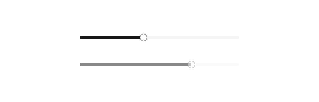

Markup
<column gap="20" width="280">
  <slider value="{volume}" on-change="volume_changed" label="Volume" />
  <slider value="0.7" disabled="true" />
</column>
The volume_changed Msg carries no payload; the sync mirror is where the applied value reaches the model (the examples/soundboard seek bar is the live pattern):
// UiApp options: .sync = sync — runs before every update dispatch
fn sync(model: *Model, layout: canvas.WidgetLayoutTree) void {
    for (layout.nodes) |node| {
        if (node.widget.kind == .slider) model.volume = node.widget.value;
    }
}
// in update: the plain Msg arm reads the mirrored field
.volume_changed => model.applyVolume(model.volume),
Zig builder
ui.column(.{ .gap = 20, .width = 280 }, .{
    ui.el(.slider, .{
        .value = model.volume,
        .on_value = Ui.valueMsg(.volume_changed),
    }, .{}),
    ui.el(.slider, .{ .value = 0.7, .disabled = true }, .{}),
})
Attributes
| Attribute | Description |
|---|---|
value | Value for slider/progress/text entry; a literal or one {binding}. |
disabled | Disables the control; true/false or a {binding}. |
on-change | Dispatch a Msg on change: tag or tag:{payload}. Hit-target elements only (slider, ...). |